
Screen Resolution Simulator


As website creators, we've all experienced the frustration of a webpage that looks perfect on one device but falls apart on another. I learned this the hard way a few years ago when I launched my blog.
I'd poured my heart into the design, convinced it was a masterpiece, only to discover it was a total disaster on my tablet—text overlapped, images stretched, and buttons disappeared. This experience truly highlighted the critical importance of testing across various devices.
If only I’d had a tool like GoogieTools’ Screen Resolution Simulator back then! This nifty tool lets you preview how your website looks on various screen sizes and resolutions in seconds, saving you from the headache I endured.
Let’s dive into why this tool is a game-changer for developers, designers, and site owners, and how it can boost your site’s user experience (UX) and SEO rankings.
What Is a Screen Resolution Simulator?
A Screen Resolution Simulator is an online tool that mimics how your website appears on different devices and screen resolutions. From smartphones to desktops, it lets you see your site through the eyes of your users, ensuring it’s visually appealing and functional across all platforms.
GoogieTools’ version is a free, user-friendly solution that eliminates the need for physical devices or complex setups. Just pop in your URL, pick a resolution, and voilà—you get an instant preview of your site’s performance.
Why does this matter? With over 50% of global web traffic coming from mobile devices, a responsive website is non-negotiable. Search engines like Google prioritize mobile-friendly sites, and a poor display on any device can tank your rankings and drive visitors away. GoogieTools’ Screen Resolution Simulator helps you catch issues before they harm your site’s UX or SEO.
Key Features of GoogieTools’ Screen Resolution Simulator
GoogieTools’ Screen Resolution Simulator is packed with features to make your testing process smooth and effective. Here’s what you get:
- Wide Range of Resolutions: Test popular resolutions like 1920x1080 (desktop), 1366x768 (laptop), 768x1024 (tablet), and 540x960 (smartphone), plus custom options for unique devices.
- Instant Preview: Enter your URL, select a resolution, and see results in seconds—no downloads or plugins required.
- Browser-Based: Works directly in your browser, making it accessible anywhere, anytime.
- Free and Unlimited Use: No hidden fees or limits, perfect for freelancers, small businesses, or hobbyists.
- User-Friendly Interface: Simple design ensures even beginners can navigate with ease.
- Responsive Design Testing: Check how your site adapts to different screen sizes, ensuring a flawless experience across devices.
These features make GoogieTools’ tool a go-to for anyone serious about creating a responsive, user-friendly website.
How to Use GoogieTools’ Screen Resolution Simulator?
Using the Screen Resolution Simulator is as easy as pie. Follow these steps to test your website:
Step 1. Visit the Tool Page: You’re already on the right page: the Screen Resolution Simulator available on Googiehost’s tools page
Step 2. Enter Your Website’s URL: In the provided input field, paste the URL of the webpage you’d like to preview.
Step 3. Choose a Screen Resolution: You can select from a variety of preset resolutions, such as: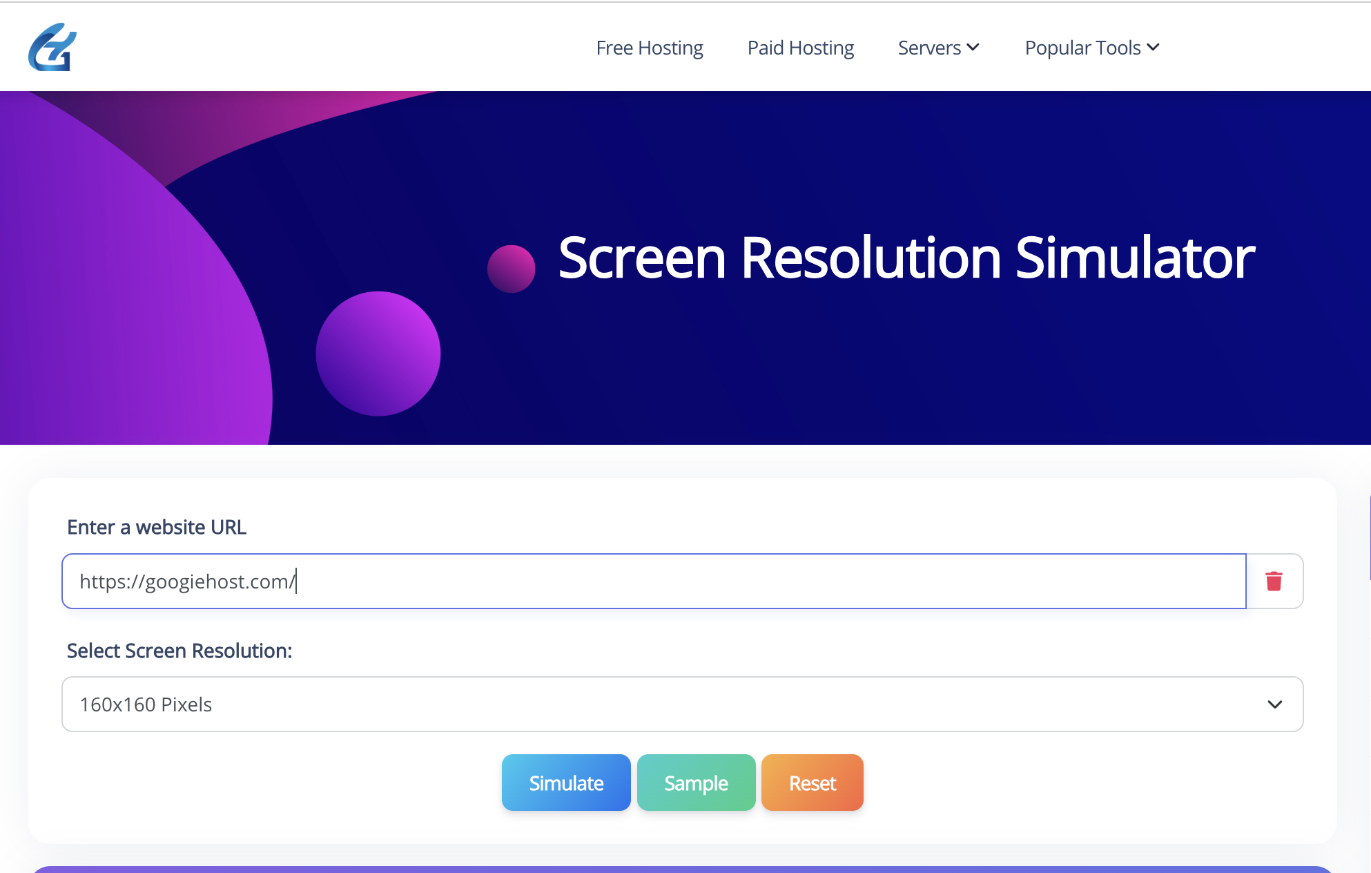
Step 4. Run the Simulation: Click Simulate (or a similar button) to view how your website appears at the selected resolution.
Review the Result: The tool will display your site within a framed browser preview showing exactly how it looks at that particular resolution.
Reset or Try Another: You can reset the view or pick another resolution—including a custom one—to compare how the layout behaves across different screen sizes
Benefits of Using a Screen Resolution Simulator for Web Development
Testing your website’s responsiveness isn’t just a nice-to-have—it’s critical for success. Here are the key benefits of using GoogieTools’ Screen Resolution Simulator:
- Ensures Cross-Device Compatibility: Guarantees your site looks and functions well on desktops, tablets, smartphones, and even TVs.
- Boosts SEO Performance: Responsive design is a ranking factor for Google. A simulator helps you optimize for mobile-first indexing.
- Improves User Engagement: A clean, accessible design encourages visitors to stay longer and interact more.
- Saves Development Time: Identify issues early, reducing the need for costly redesigns post-launch.
- Enhances Accessibility: Ensure text, buttons, and navigation are usable for all visitors, including those using screen readers.
By catching issues like overlapping text or missing images, you create a website that’s both user-friendly and search-engine-friendly.
Pros and Cons of GoogieTools’ Screen Resolution Simulator
Like any tool, GoogieTools’ Screen Resolution Simulator has its strengths and limitations. Here’s a balanced look:
Pros
- Free to Use: No subscription or payment required, making it accessible for all.
- Fast and Efficient: Delivers instant results, streamlining your testing process.
- Wide Device Coverage: Supports a variety of resolutions, from mobile to ultra-wide monitors.
- No Installation Needed: Runs in your browser, saving you from software downloads.
- Beginner-Friendly: Intuitive interface requires no technical expertise.
Cons
- Limited Advanced Features: Lacks in-depth analytics like some premium tools (e.g., browser compatibility testing).
- Manual Input Required: You need to enter custom resolutions manually, which might be tedious for niche devices.
- No Real-Time Collaboration: Doesn’t support team-based testing or live feedback.
Despite these minor drawbacks, the tool’s simplicity and cost-effectiveness make it a fantastic choice for most users.
Why Do You Need GoogieTools’ Screen Resolution Simulator?
Imagine launching a website that looks stunning on your desktop but is a jumbled mess on a phone. Users won’t stick around, and Google will notice. A responsive website design ensures consistency across devices, and testing with a screen resolution simulator is the easiest way to achieve it.
Here’s why GoogieTools’ tool is a must-have:
- Saves Time and Money: No need to buy multiple devices or spend hours manually resizing browser windows.
- Improves SEO: Google’s mobile-first indexing means a responsive site ranks higher. Testing with GoogieTools ensures your site meets these standards.
- Enhances User Experience: A seamless design keeps visitors engaged, reducing bounce rates and boosting conversions.
- Catches Errors Early: Spot misaligned content, unreadable text, or broken buttons before your site goes live.
I learned this the hard way when my blog’s mobile version had a navigation menu that was impossible to click. A quick test with a tool like this could’ve saved me weeks of troubleshooting and lost traffic.
Common Screen Resolutions to Test
Not sure which resolutions to prioritize? Here’s a list of common screen sizes to test with GoogieTools’ Screen Resolution Simulator:
- Smartphones: 360x640, 414x896, 540x960
- Tablets: 768x1024, 810x1080
- Laptops: 1366x768, 1440x900
- Desktops: 1920x1080, 2560x1440
- Custom Sizes: Enter specific resolutions for niche devices like TVs or foldable phones.
Testing these ensures your site caters to the majority of your audience.
Why GoogieTools Stands Out
With so many screen resolution simulators out there, why choose GoogieTools? Here’s what sets it apart:
- Completely Free: Unlike some tools with paywalls, GoogieTools offers unlimited access at no cost.
- No Learning Curve: Its straightforward design means you can start testing instantly.
- Reliable Performance: Fast and accurate, it delivers consistent results without glitches.
- SEO-Focused: Helps you optimize for Google’s mobile-first indexing, boosting your rankings.
GoogieTools combines simplicity with functionality, making it ideal for beginners and pros alike.
Frequently Asked Questions About Screen Resolution Simulators
Got questions? Here are answers to common ones, optimized for searches like "FAQs on screen resolution simulation tools."
Q1. What is the difference between screen resolution and screen size?
Ans. Resolution refers to pixel count (e.g., 1920x1080), while size is the physical dimensions. The simulator handles both for accurate previews.
Q2. Can I simulate ultra-high resolutions like 4K?
Ans. Yes! GoogieTools supports up to 3840x2160 and beyond with custom inputs.
Q3. Is this tool accurate for all devices?
Ans. It's highly accurate for web previews but can't replicate hardware-specific quirks like battery drain.
Q4. How does this help with SEO?
Ans. By ensuring mobile-friendliness, it improves user engagement signals that search engines love.
Q5. Do I need coding knowledge to use it?
Ans. Nope! It's beginner-friendly, though devs will love the depth.
Conclusion: Elevate Your Website with GoogieTools’ Screen Resolution Simulator
Picture this: Your website looks flawless on every device, from a tiny smartphone to a massive desktop monitor. Visitors stay longer, engage more, and keep coming back. Your SEO rankings climb, and your bounce rate drops.
Sounds like a dream, right? With GoogieTools’ Screen Resolution Simulator, it’s reality. This free, easy-to-use tool empowers you to test your site across countless resolutions, ensuring a seamless user experience and a search-engine-friendly design. No more guesswork, no more costly mistakes—just a website that works for everyone.
Whether you’re a developer fine-tuning a client project, a designer perfecting a portfolio, or a business owner boosting conversions, GoogieTools has your back. By catching design flaws early, optimizing for mobile-first indexing, and enhancing UX, this tool is your secret weapon for digital success. So, why wait? Head to GoogieTools, pop in your URL, and start testing today. Your website—and your visitors—will thank you.

Aman Singh
CREATIVE HEAD
Enjoy the little things in life. For one day, you may look back and realize they were the big things. Many of life's failures are people who did not realize how close they were to success when they gave up.